Designing a unique wayfinding icon set for a heritage mountain destination
Graphic design


Drawing inspiration from the logo
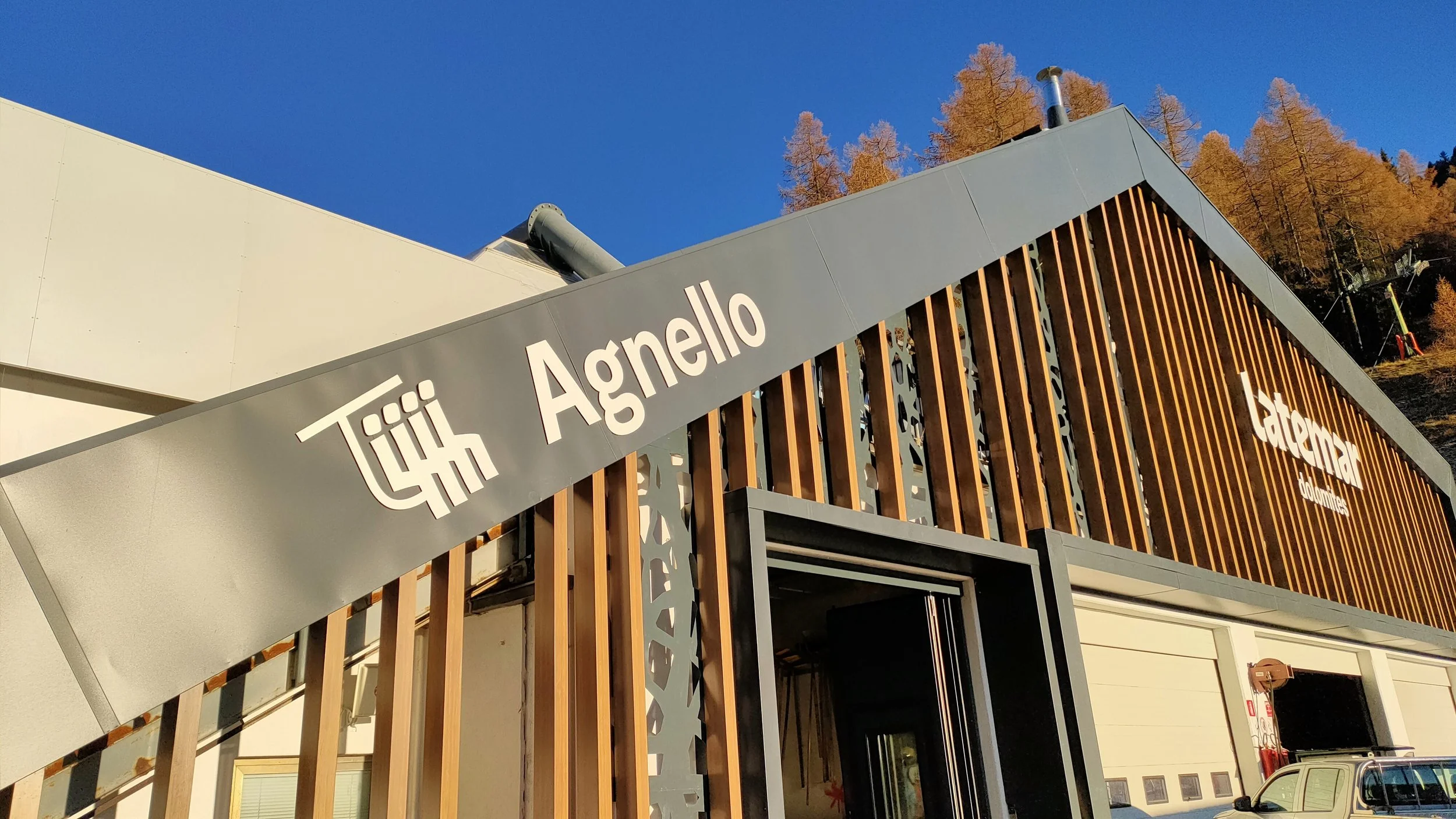
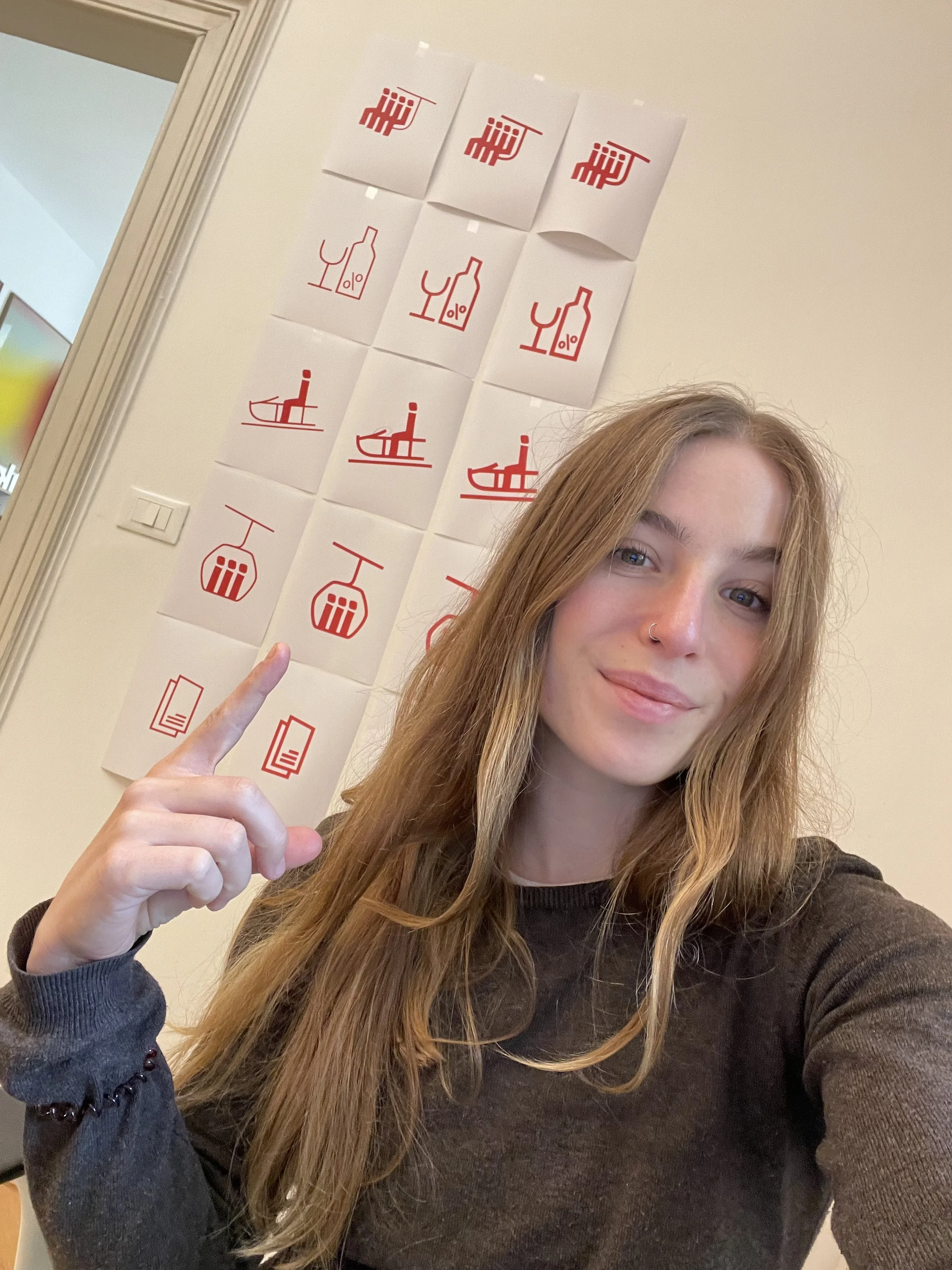
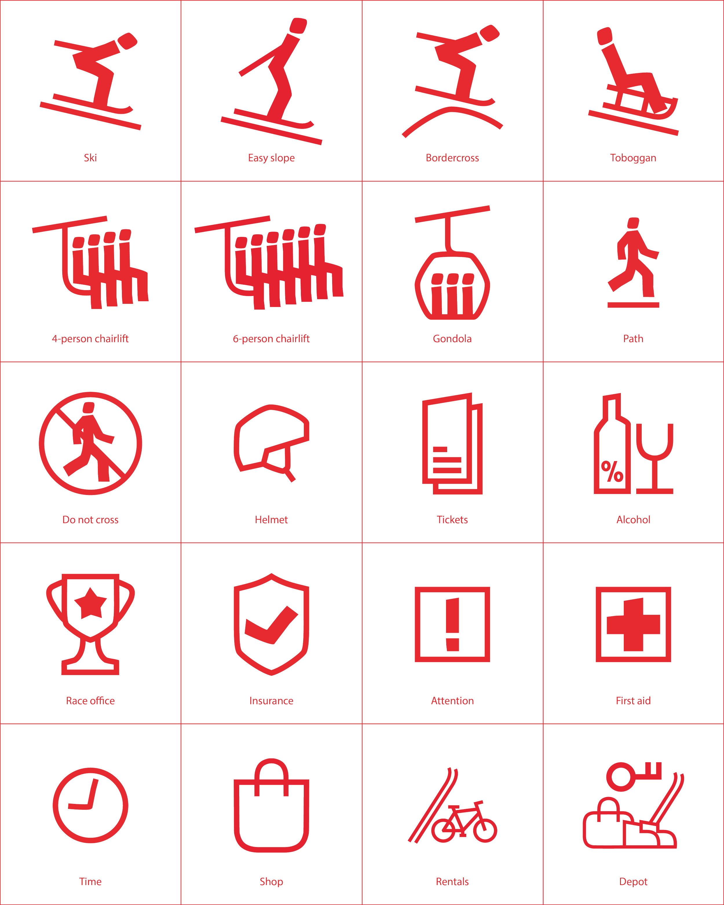
I built the icon set from shapes and construction principles found in the new Latemar logotype. Every sign reinforces the brand without needing a logo beside it, and the shared formal language keeps the system consistent as new icons are added.
A new look for the Latemar Mountain Range
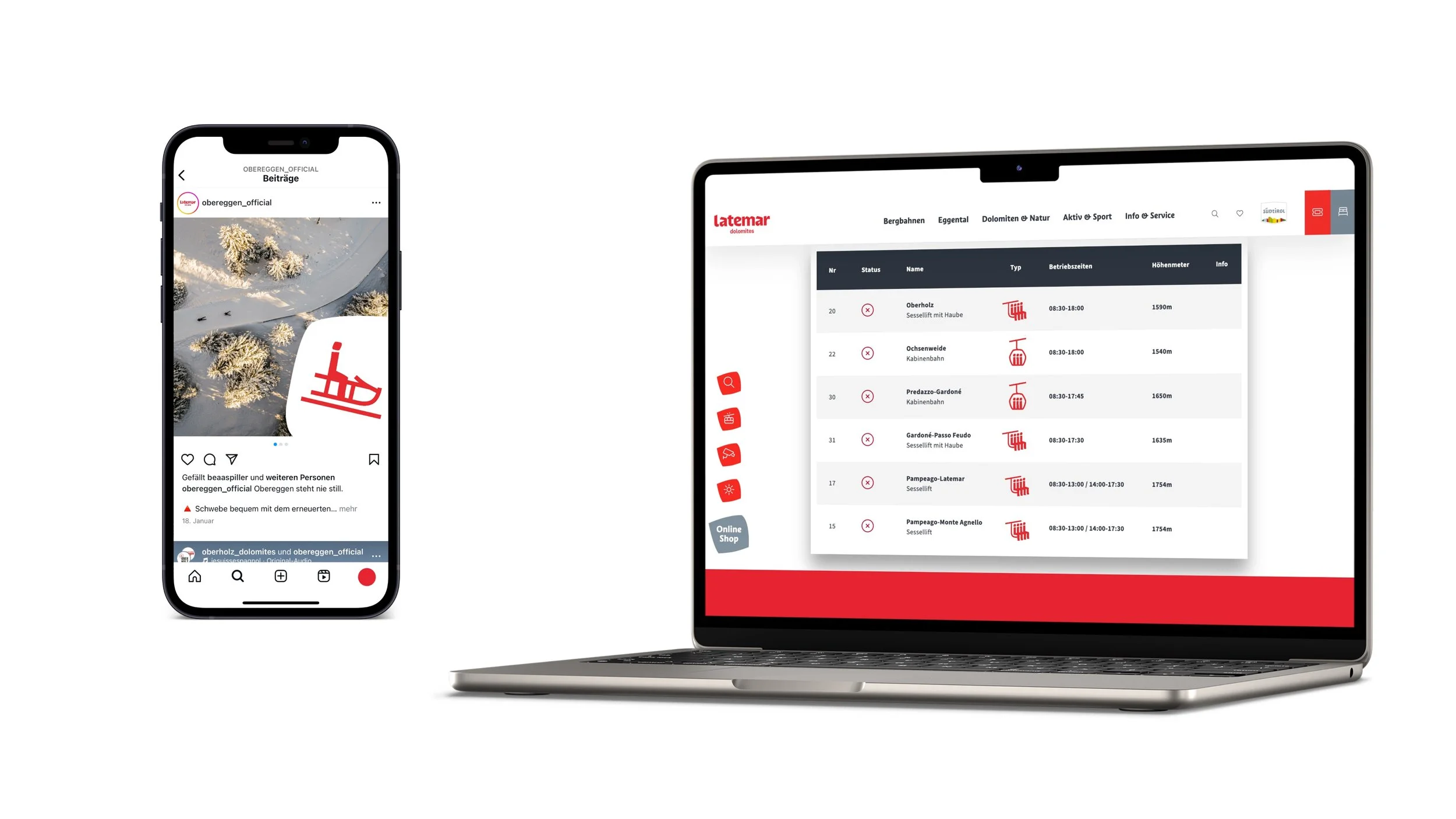
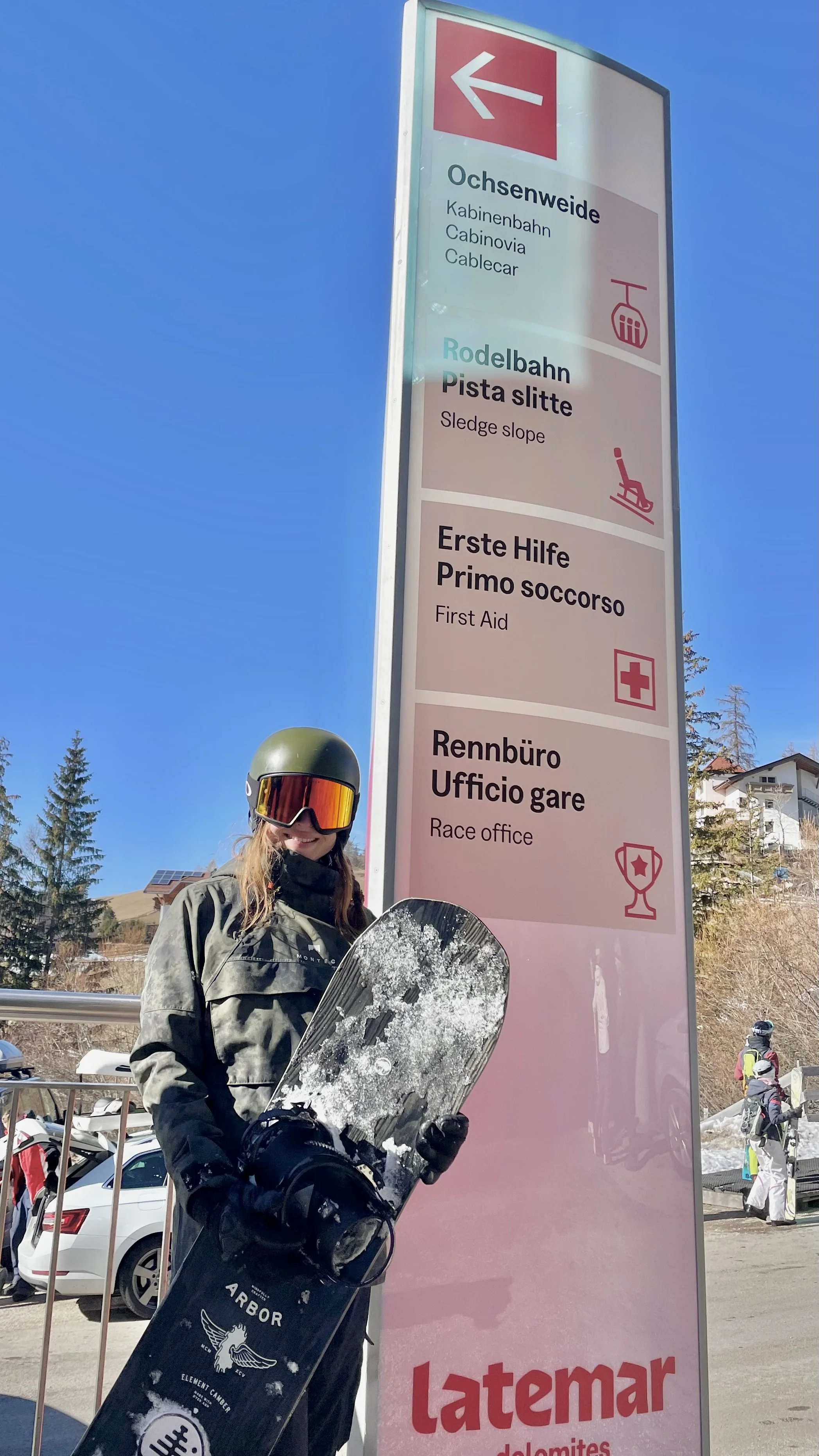
Latemar is a mountain range in the Dolomites of northern Italy, known for its hiking, skiing, and UNESCO-listed rock formations. During my time at zukunvt, I had the opportunity to be part of the regions strategic and visual re-branding process. As part of the design team, I created a set of eye-catching icons for signage and way finding.

To keep the icons functional first, I designed them around a few readability criteria:
Instant recognition:
one clear concept per icon, understood at a glance.
Bold, simplified forms:
heavy shapes and open counters that hold up at distance and in snow, glare, or rain.
Consistent grammar:
shared stroke weight, proportions, and corners, so visitors learn the system once.
Clear differentiation:
related categories like hiking and skiing stay easy to tell apart.